|
|
Post by juliettedevou on Jun 17, 2009 21:07:39 GMT -5
|
|
|
|
Post by sylvia on Jun 25, 2009 16:25:12 GMT -5
i liketh the text, but in the signature the blue is so bright and looks so flashy next to the sort of boring green and the other color blue that you have. judging by if you're using curves or not, you could have modified to blue os green. since i confuzzle people, 9 / 10
|
|
|
|
Post by juliettedevou on Jun 25, 2009 19:40:11 GMT -5
|
|
|
|
Post by Lorcan Furey on Jun 28, 2009 0:28:42 GMT -5
8/10
I iike it a lot! The only thing is that I'm not so much of a fan of two pic sigs. Even so it's great! =D
|
|
|
|
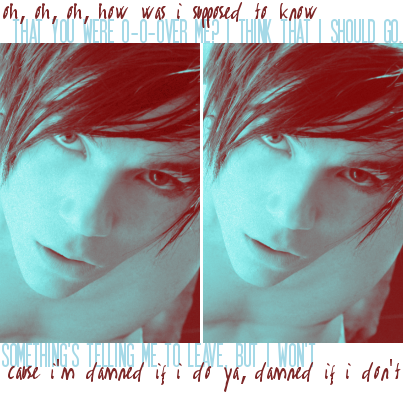
Post by Skyler Kanes on Jun 28, 2009 7:47:28 GMT -5
three of ten
it's lacking in any sort of color at all. it's just this white dude on a black background. It's the same picture, but on the right, it looks like he's got his finger shoved up his nose. The overlapping, translucent effect confuses my small brain. The name should be smaller, and perhaps rearranged. Also, it's empty. I know it sounds horrible, but I just don't like it.
( please don't eat me ^^ ) |
|
|
|
Post by sylvia on Jul 1, 2009 12:38:00 GMT -5
ten out of ten
yeah, skye, i went there.
(btw tiz liveh !) |
|
|
|
Post by Lorcan Furey on Jul 6, 2009 11:39:50 GMT -5
8/10
It's simple but amazing! Looks great! =D
|
|
|
|
Post by William Radfield on Jul 7, 2009 12:32:15 GMT -5
eight of ten
way too large for my tastes, and it stretches the page. Also, I think you could have blended the black and white images together rather than just paste them on. I must compliment you on your cropping skills, the coloring, and the texture. Fabulous. ^^ |
|
|
|
Post by jenna caitrin aiken on Nov 12, 2009 13:31:46 GMT -5
ten of ten, bby
. . . wait, I have to say why? *thinks of something real quick* Uhh. . .I love the pictures. It loses a point for the scribbles, but since it was an eleven out of ten anyways, it's all good. |
|
Aiden Furey
Senior!
 Why am I the invisible one?
Posts: 54
|
Post by Aiden Furey on Nov 14, 2009 0:29:24 GMT -5
10 of 10!
I love your siggy! The quote sort of ties into our plot too =D
|
|
|
|
Post by jenna caitrin aiken on Nov 30, 2009 10:51:23 GMT -5
eight of ten
Over all, your sig is done well. It loses points for having so much all at once, however, because ( to me ) it looks too busy with all the pictures plus the text. |
|
|
|
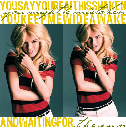
Post by Skyler Kanes on Dec 8, 2009 20:16:05 GMT -5
--- of ten
'cause I made it. xD
I'm posting here so I get can an opinion on THIS bad boy. |
|
|
|
Post by Lorcan Furey on Dec 8, 2009 21:07:04 GMT -5
q3420p5283440/10
HOMYSHIZZ it's amazing!! =D
*Yes, that's a q. Its so amazing I'm counting numbers with LETTERS! xD*
|
|
Elise Finn
Junior!
 You dont alter vera to fit you, you alter yourself to fit vera!
Posts: 28
|
Post by Elise Finn on Dec 13, 2009 13:55:43 GMT -5
ehh i say 5 out of ten, it lacks orginality...its very bland.
|
|
|
|
Post by William Radfield on Dec 31, 2009 14:21:33 GMT -5
--- of ten
.. why do I make so many of the graphics on this site? Dx |
|